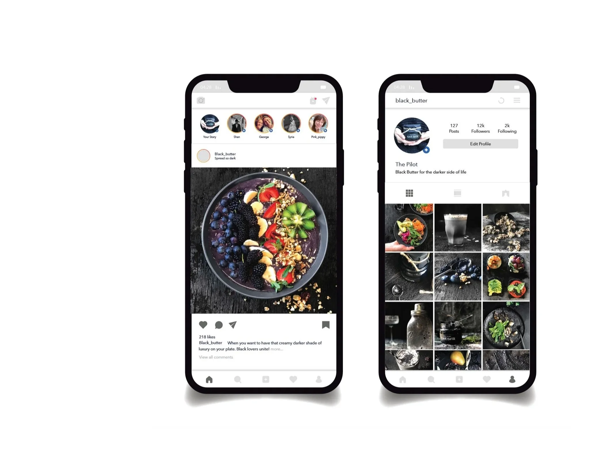
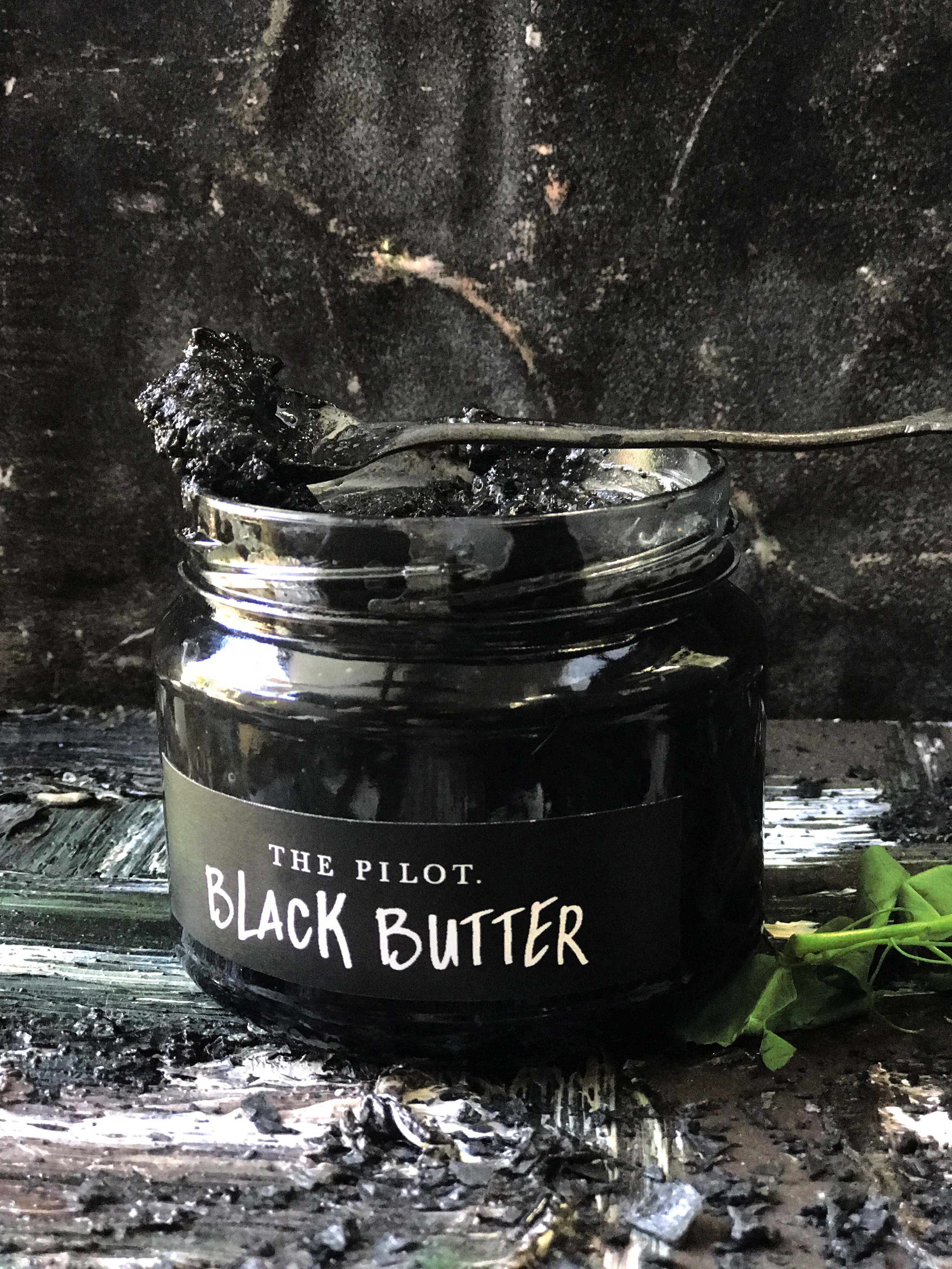
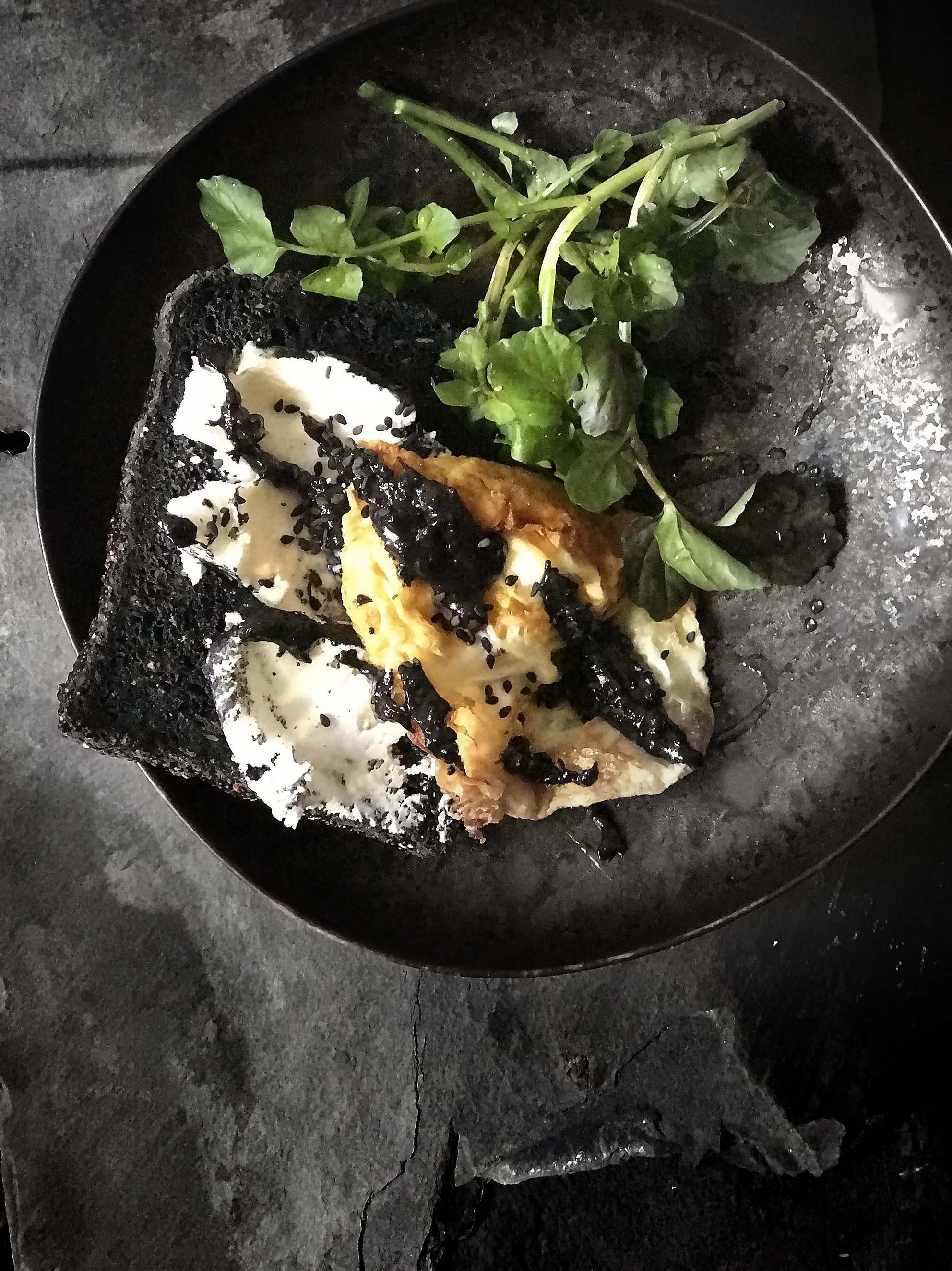
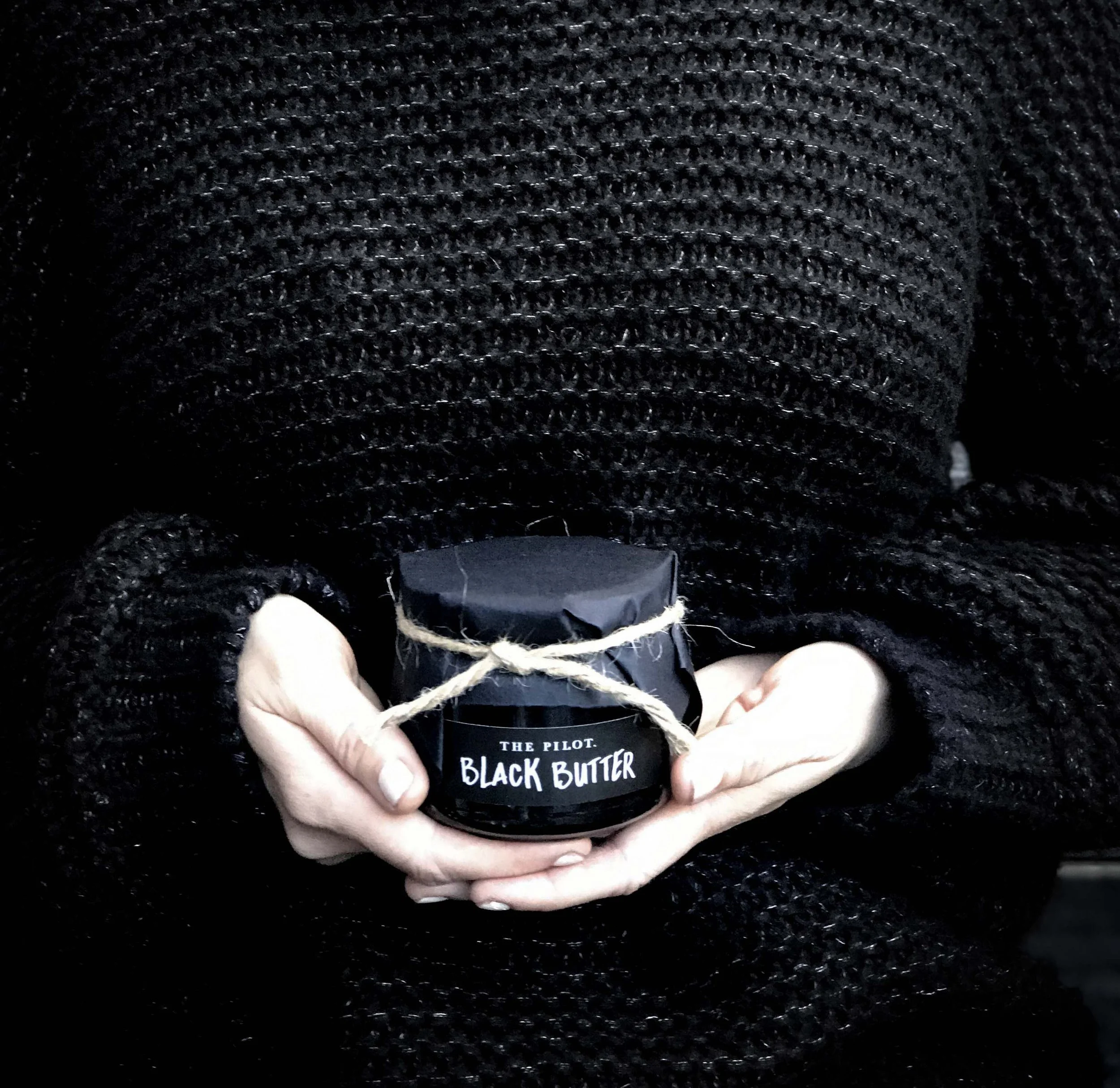
Product branding and website presencethe dark alternative to peanut butter – black butter
New product to market and it needed to feel elevated to align to the price point and approachable for mass uptake
What else…
-
CHALLENGE
To create an end-to-end product and brand from the ground up – defining not just the visual language but the product itself, its positioning, and how it would live in the world. With complete creative control came full responsibility for clarity, coherence and quality.
SOLUTION
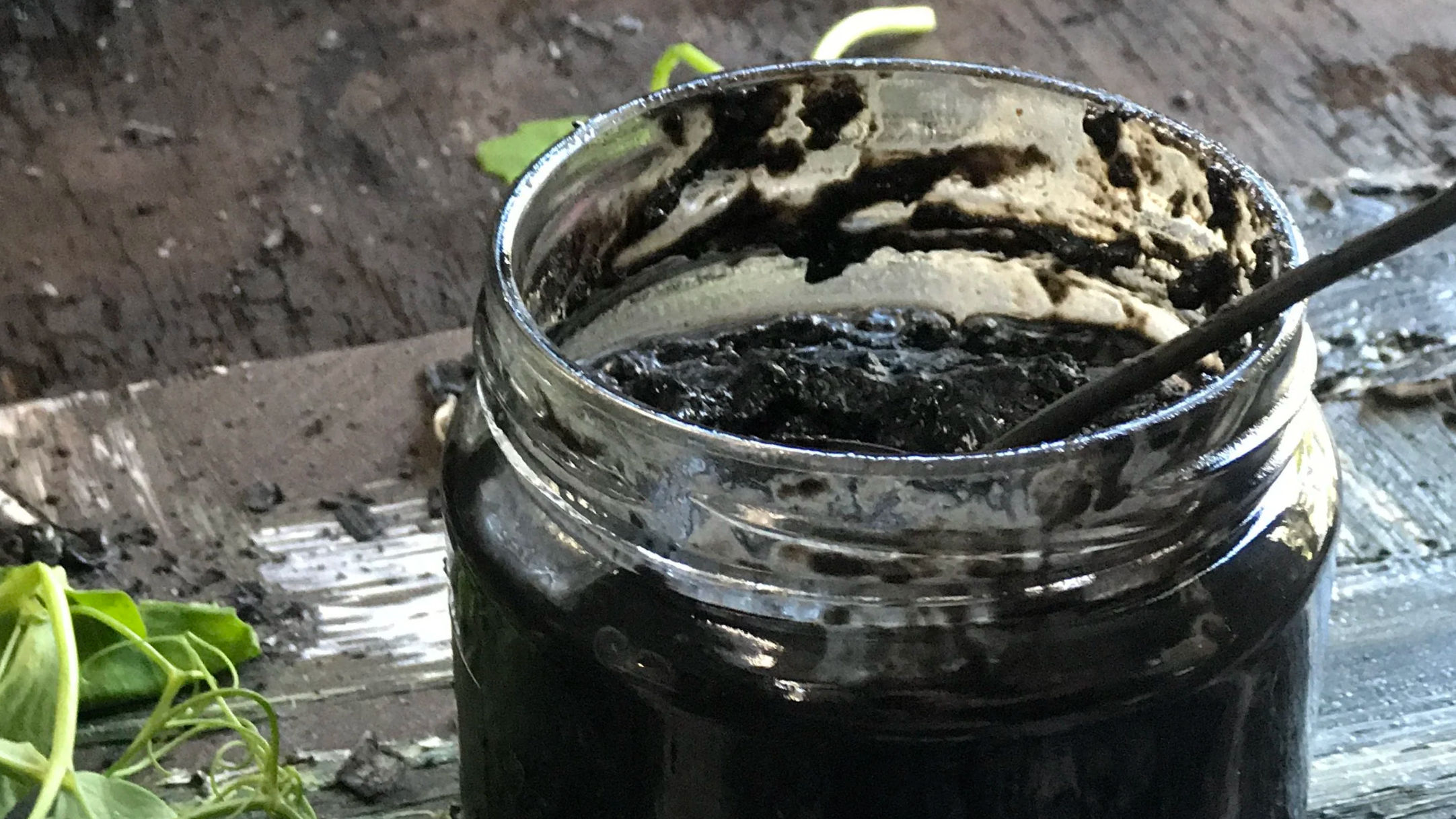
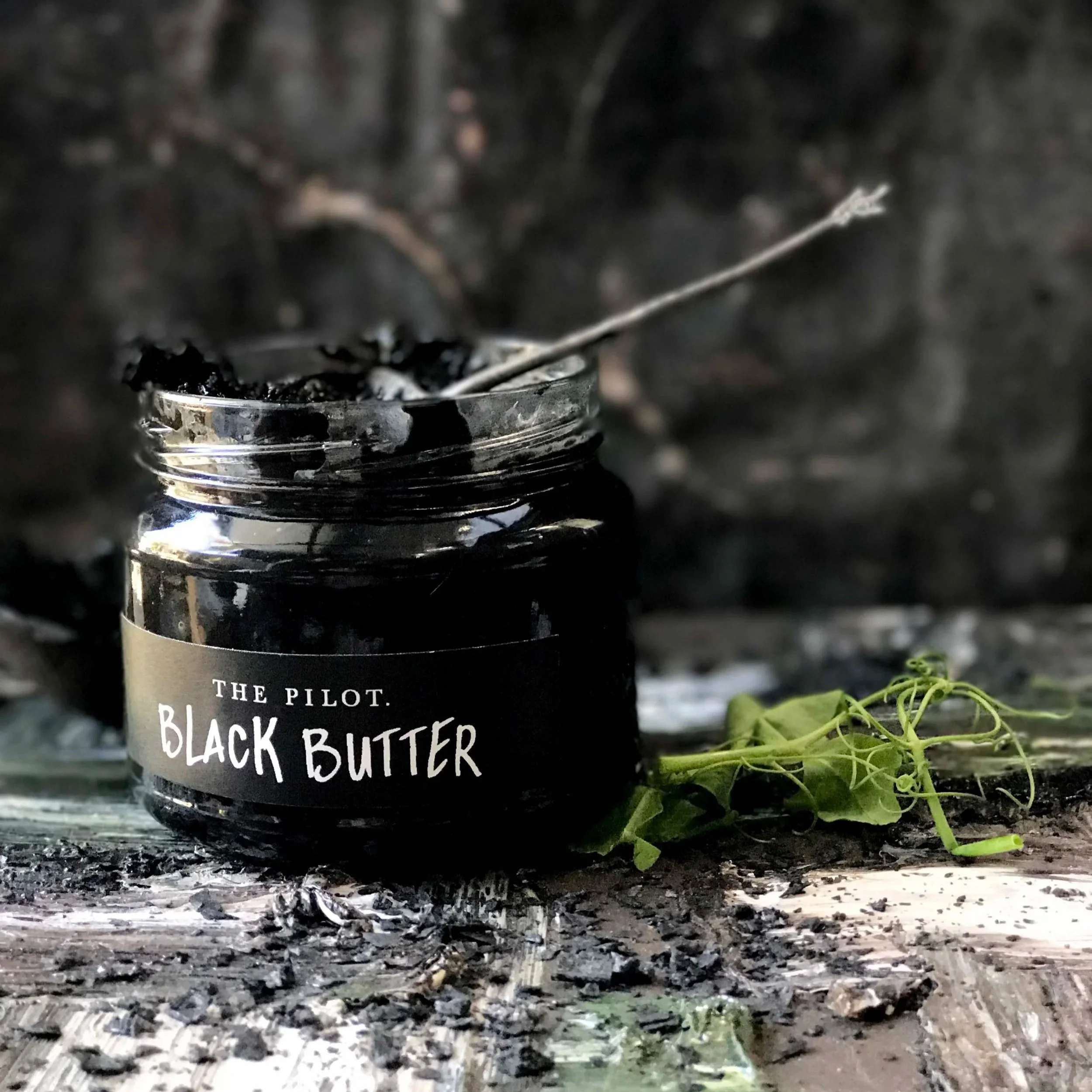
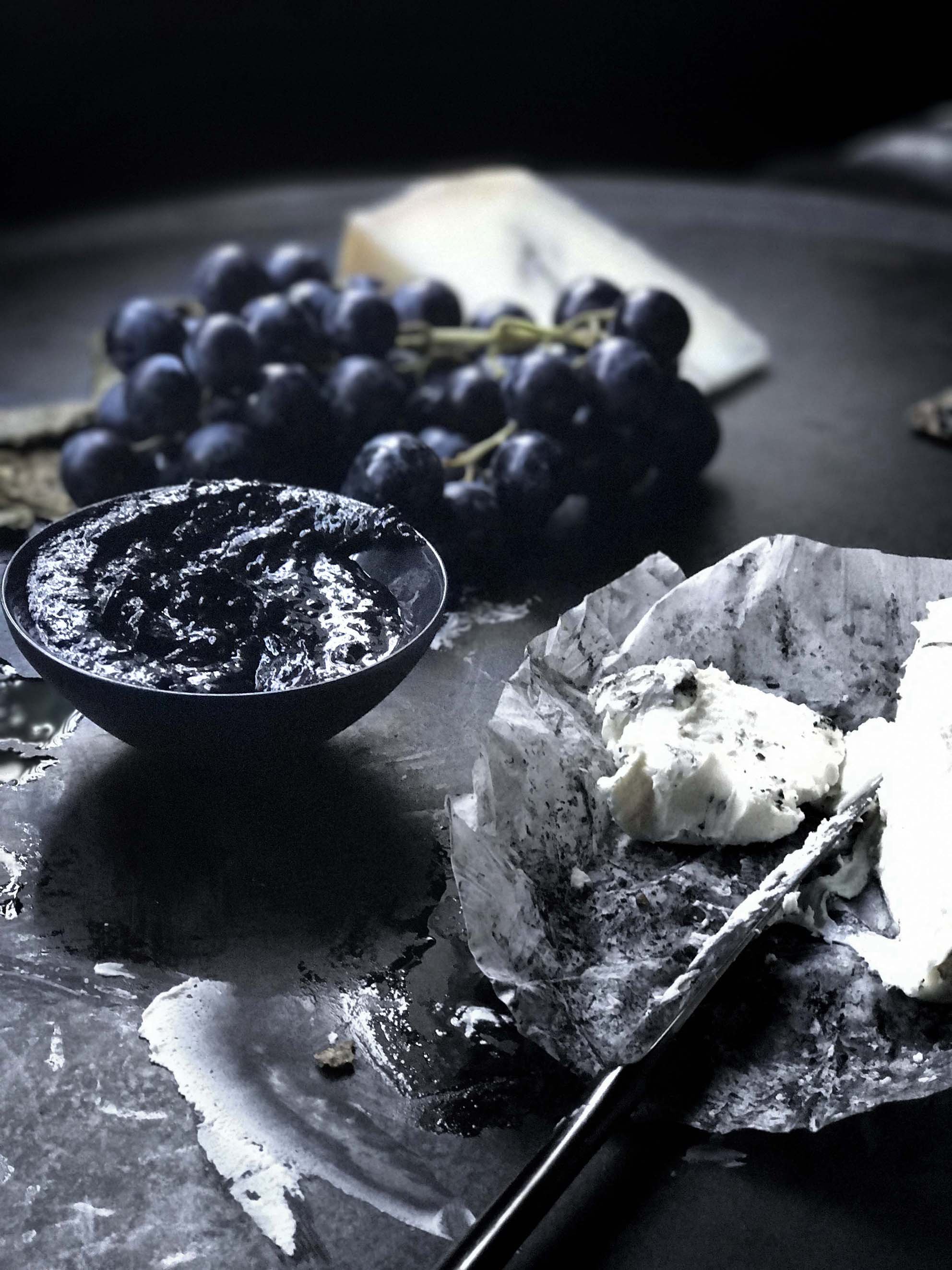
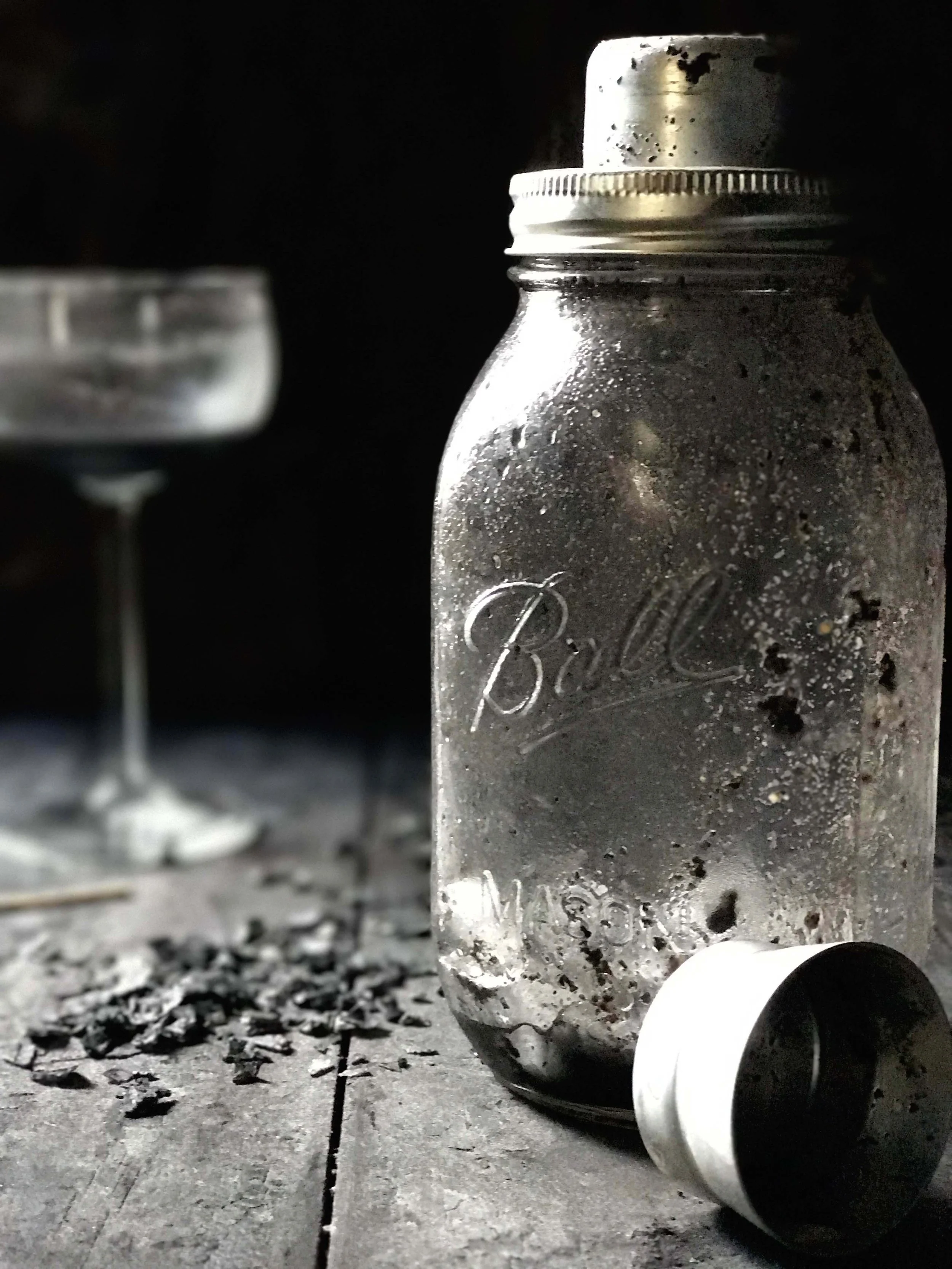
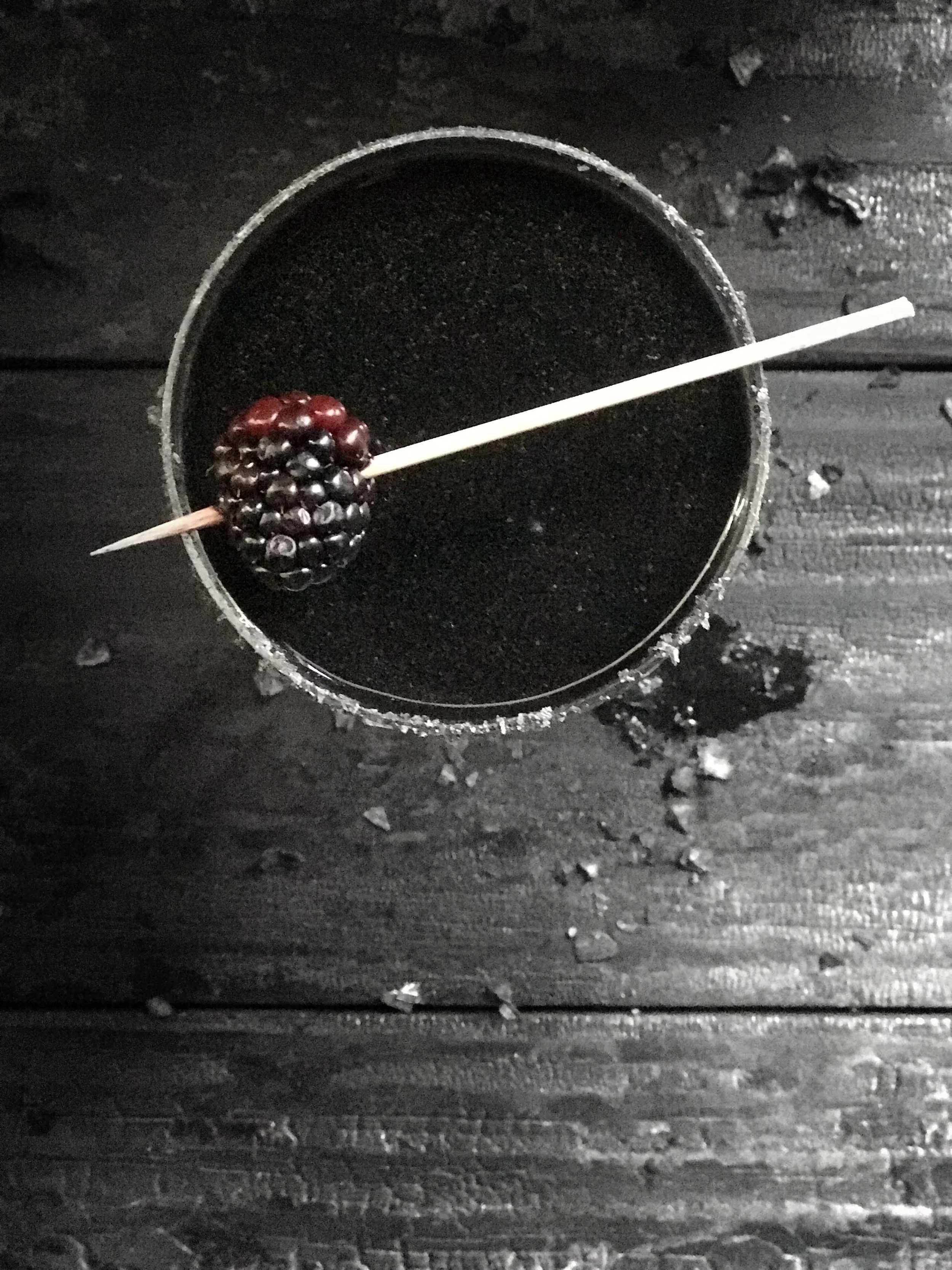
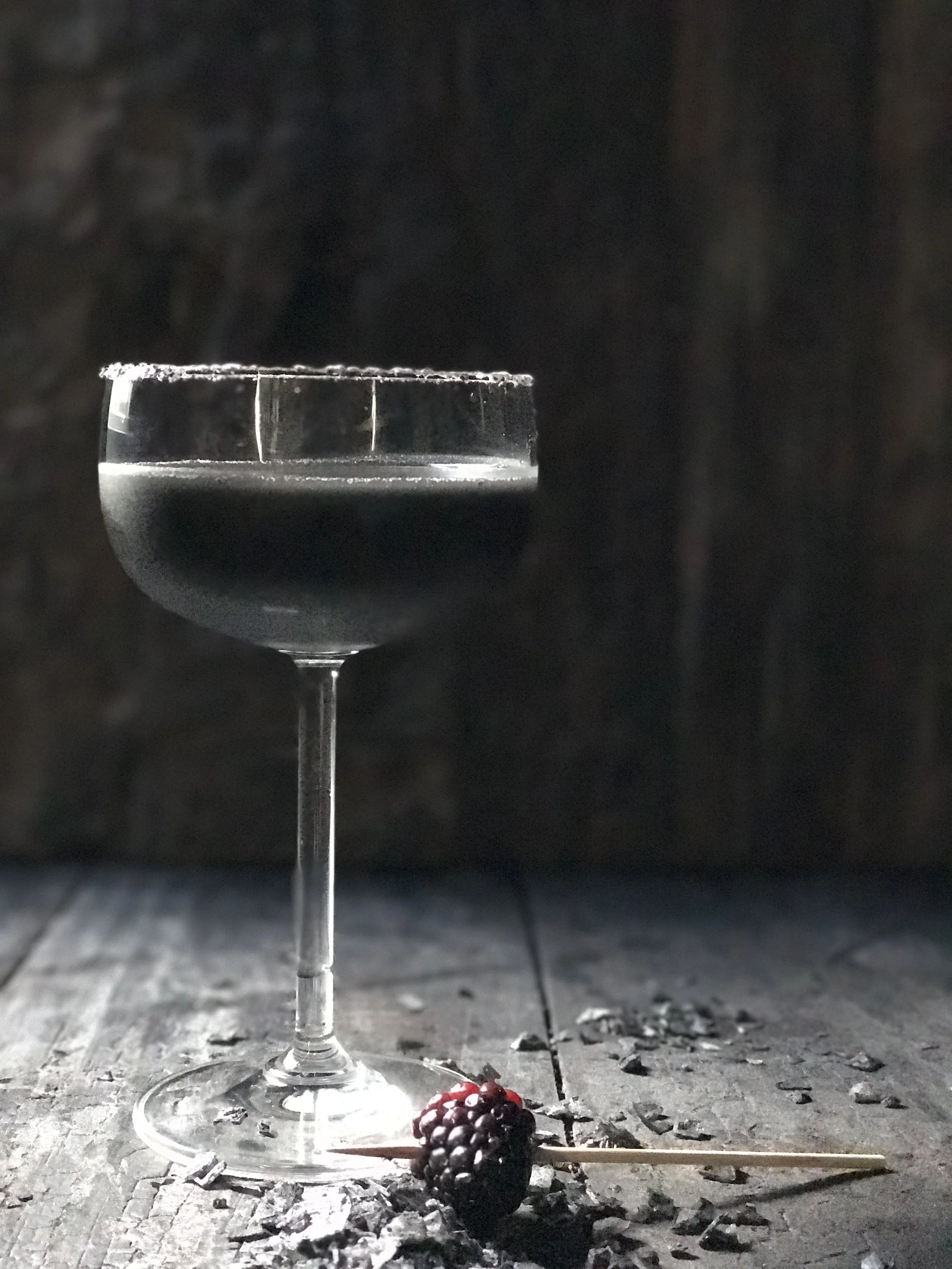
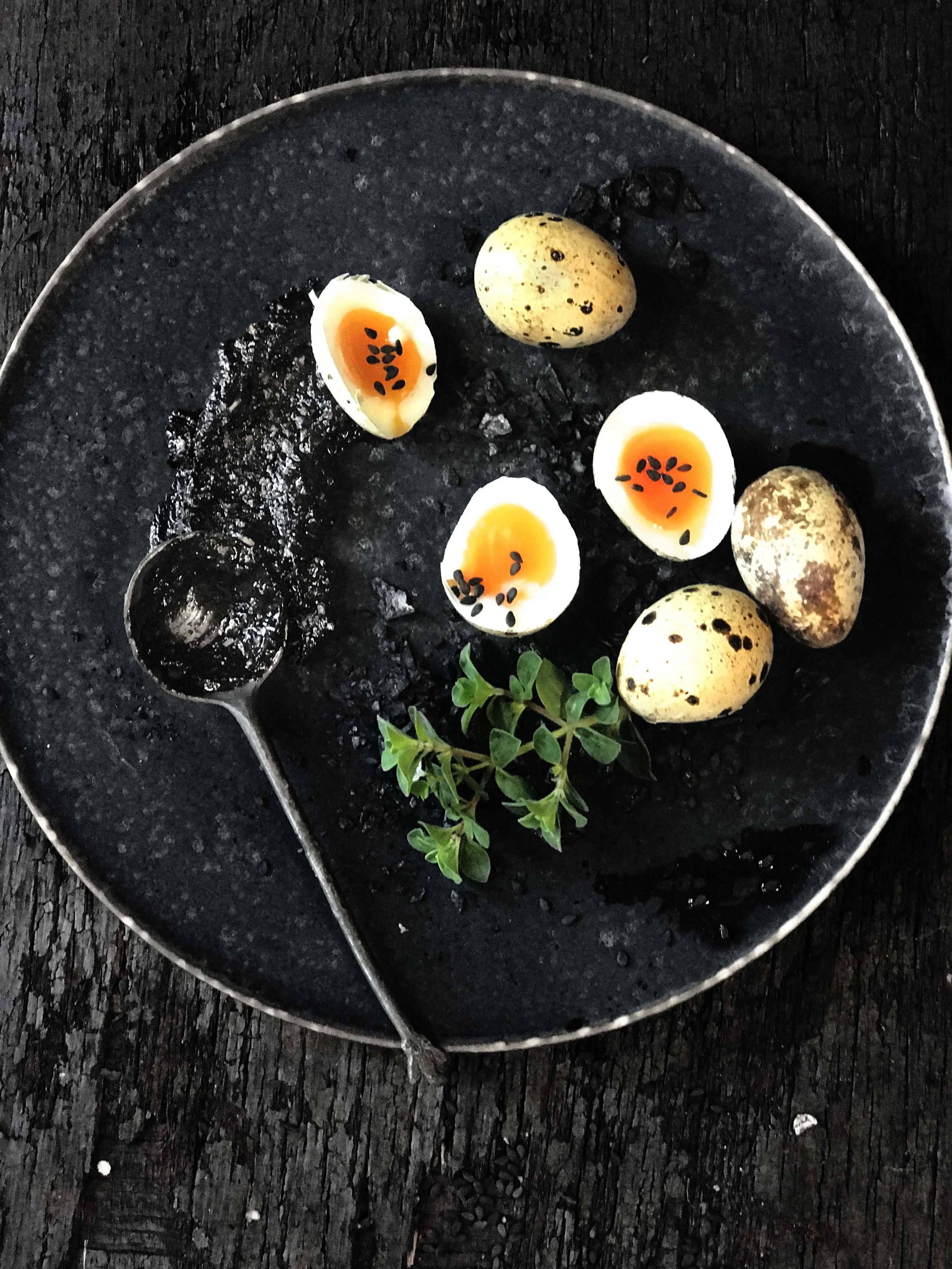
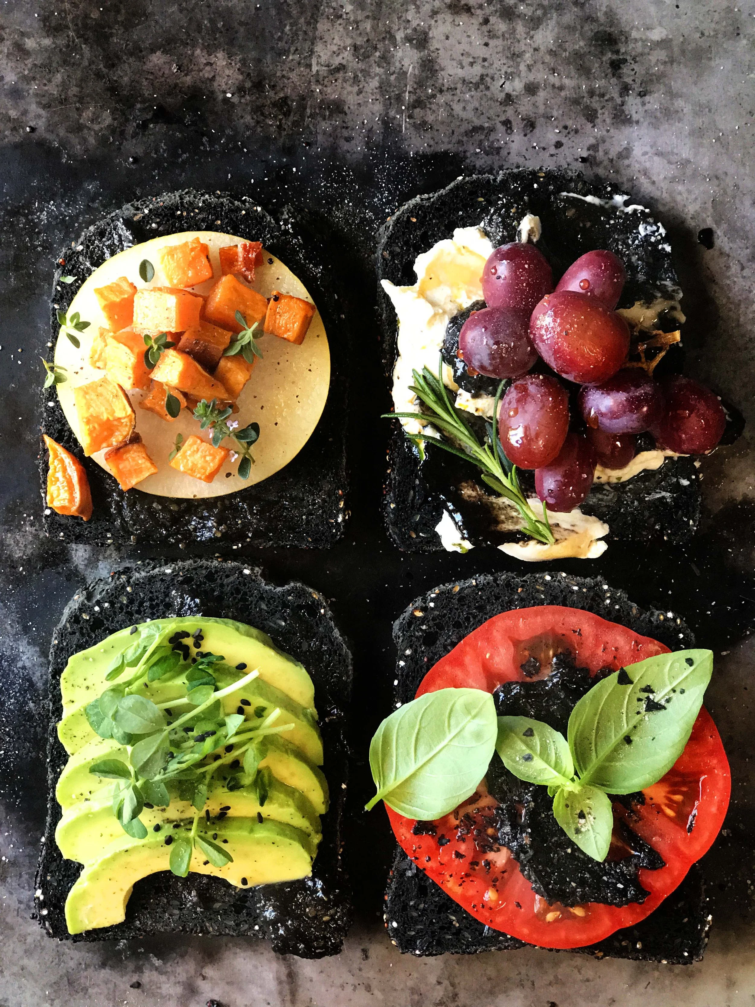
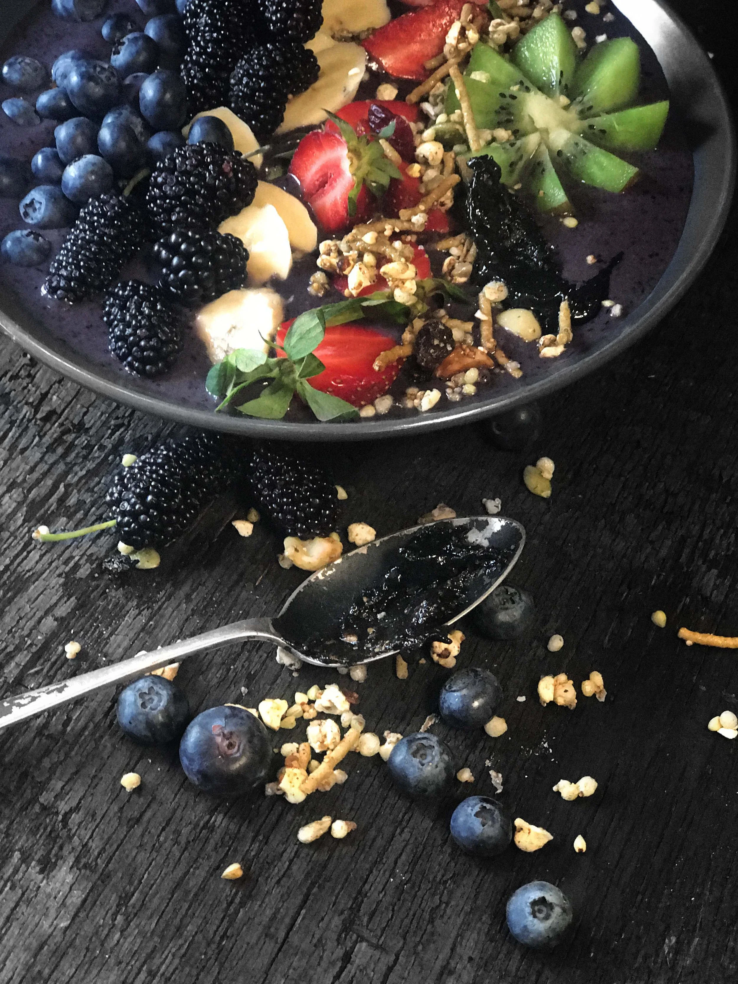
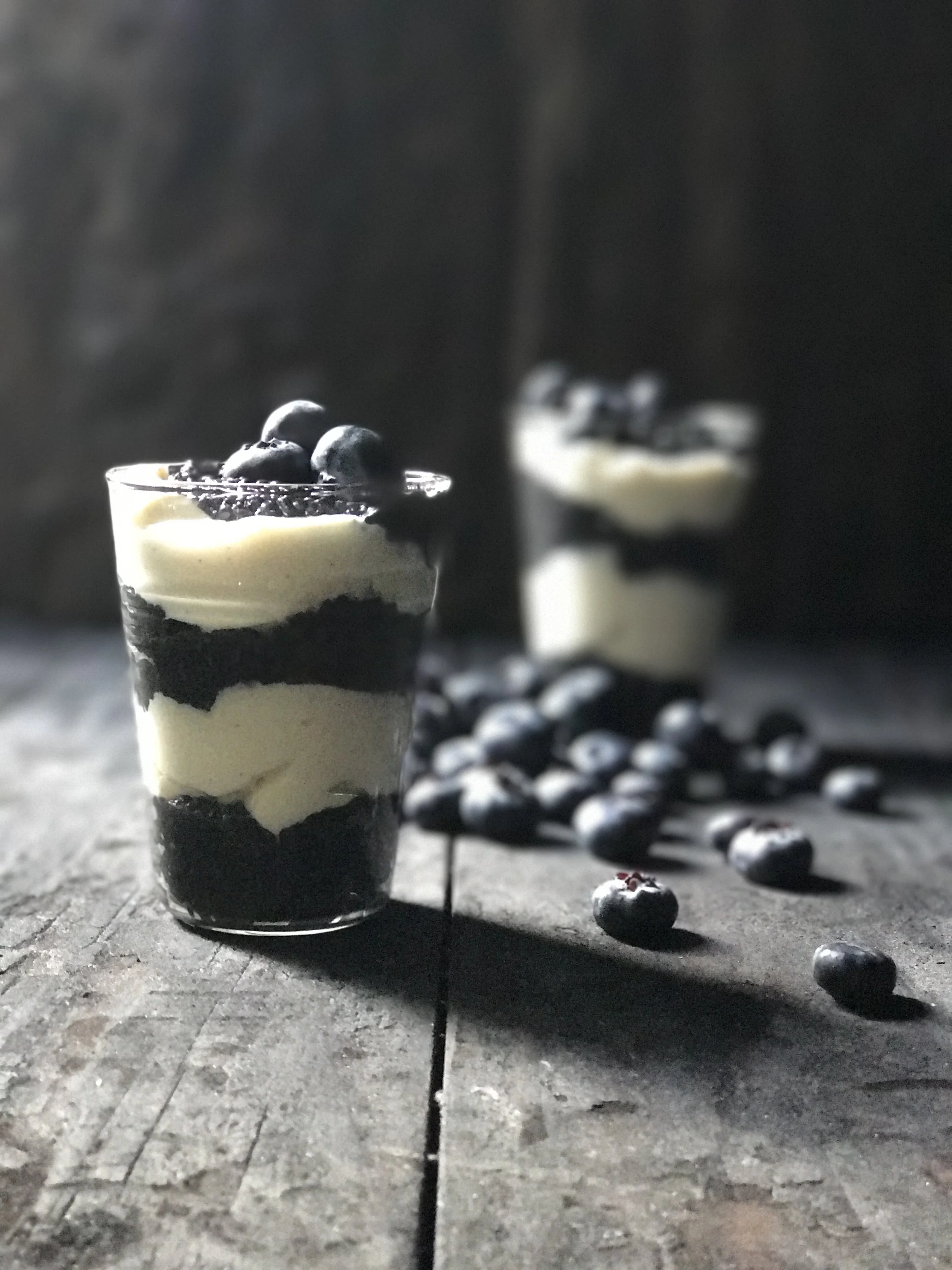
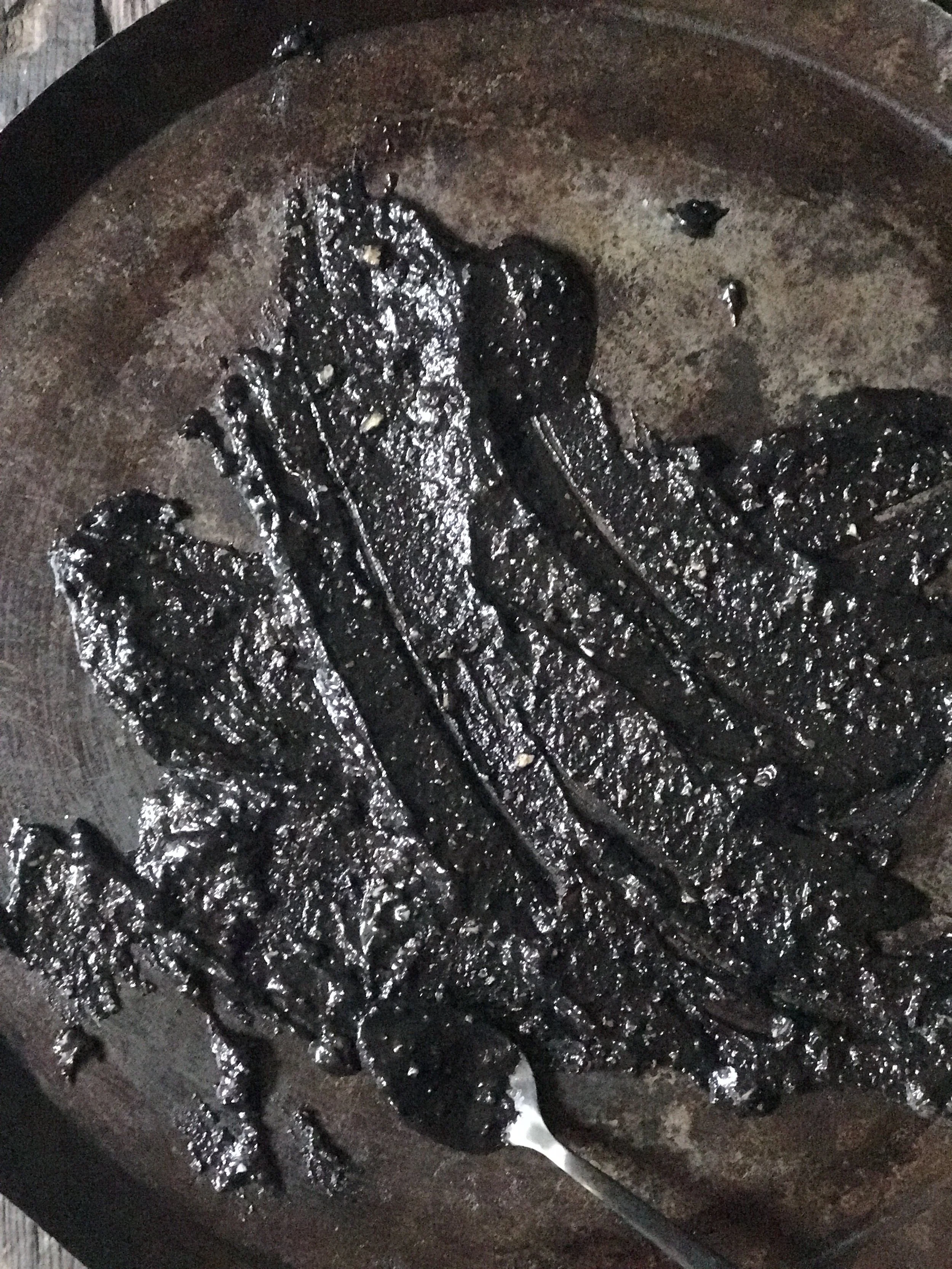
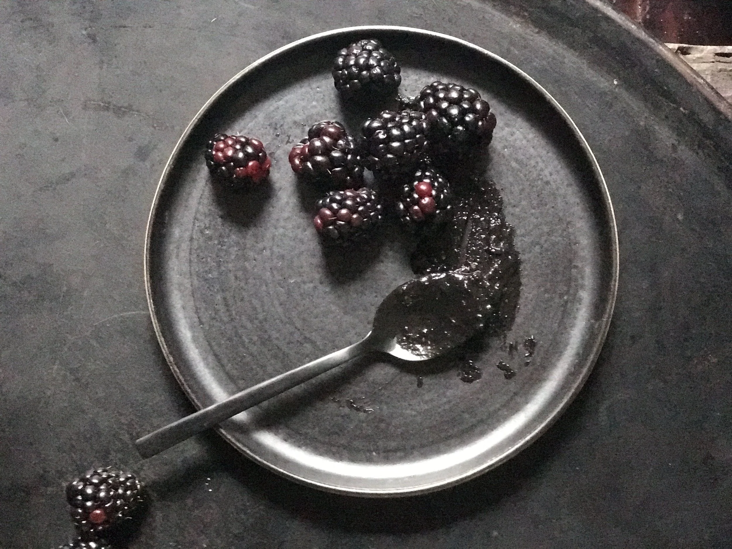
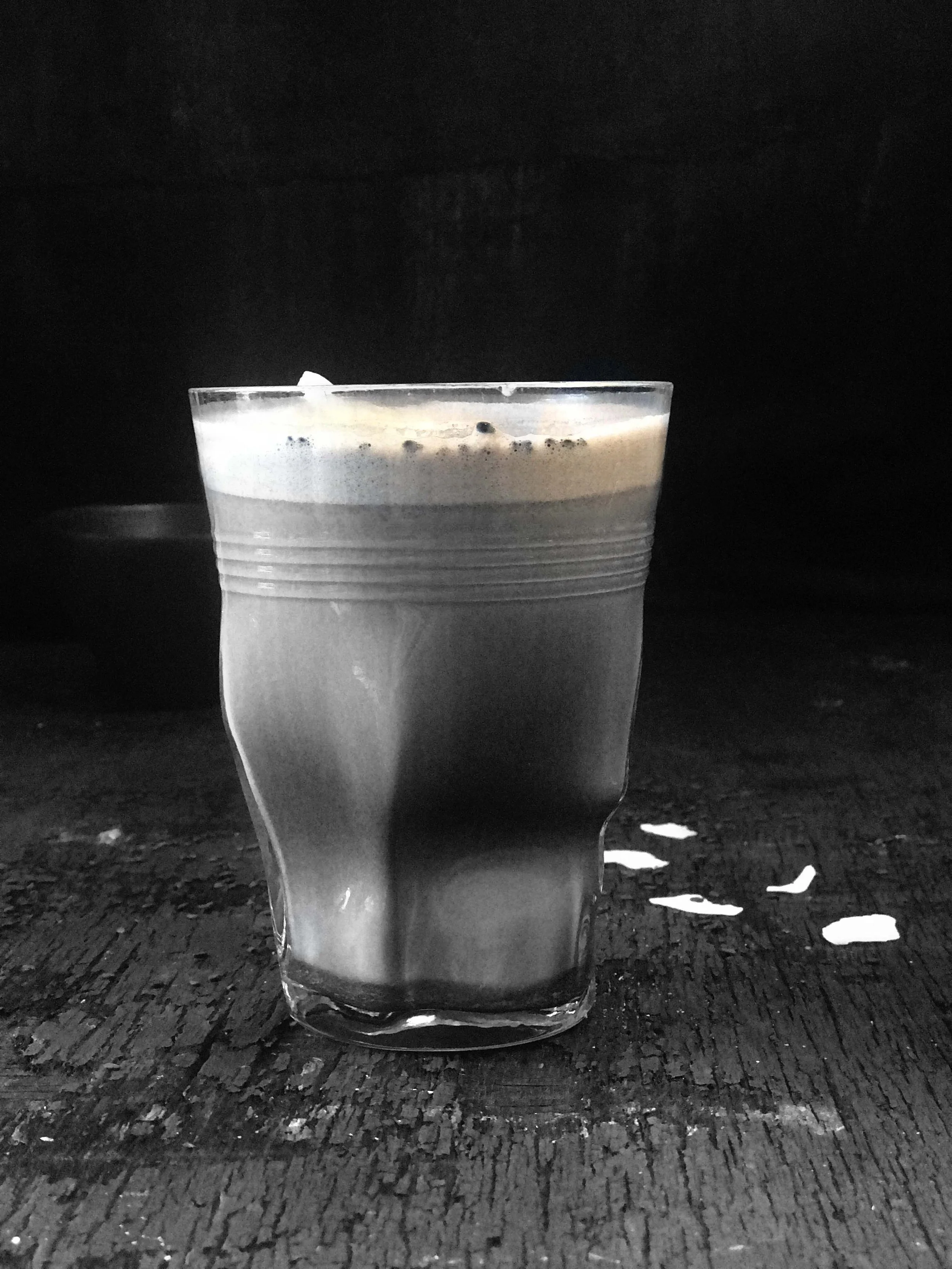
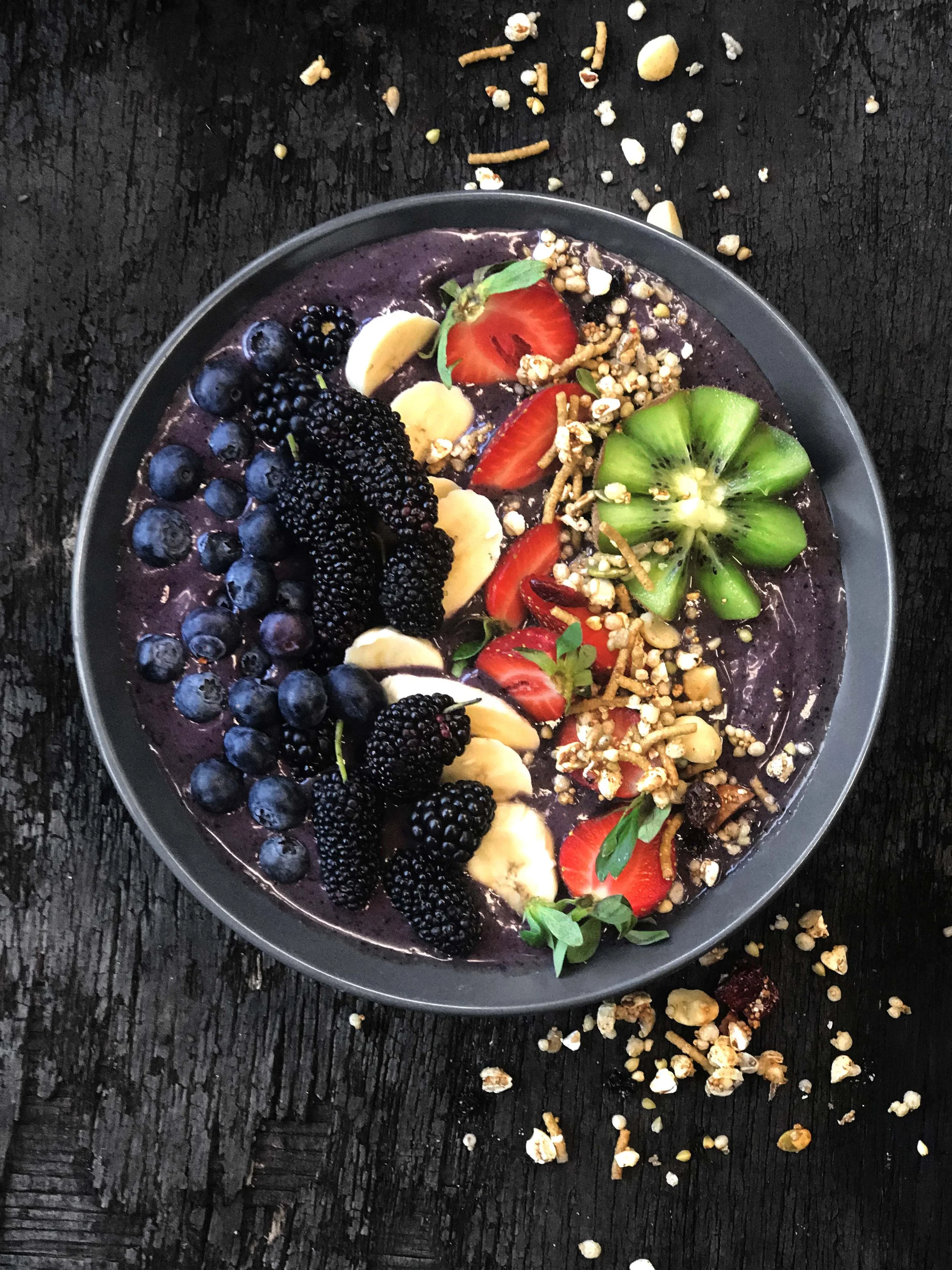
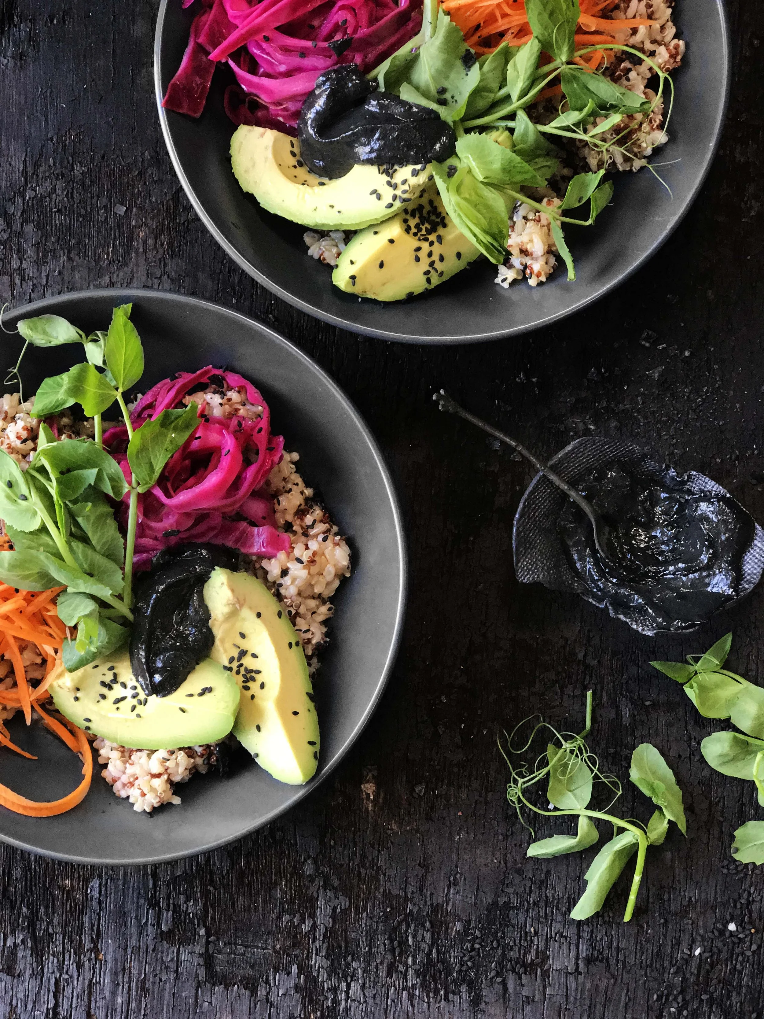
The brand was built around contrast and simplicity – dark, tactile and deliberately restrained. The visual language drew from taste and sensibility, inspired by still-life photography, which allowed the product to move away from the commercial, and instead inhabit the elevated space of curated design.
Typography, tone and photography were developed as a unified system, ensuring consistency across packaging, imagery, site and all comms. Together, they were designed to do two things at once: make the product instantly familiar, and give it a point of view. The result was a brand that felt recognisable without imitation, and confident without explanation.
-
Product concept and development
Brand identity and packaging
Photography and styling
Marketing and communications assets
Business planning and positioning
-
Creative director, designer, photographer, stylist and producer.
I led every aspect of the project – from product ideation and brand strategy through to visual execution and go-to-market planning.
-
Black Butter demonstrated the value of a tightly held creative vision – where product, brand and storytelling are developed as a single system. The project reinforced my approach to creative leadership; originating ideas, setting clear point of view and executing with restraint and intent.